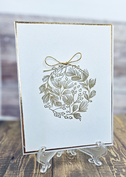
Hello crafters! Today I have a tutorial on how to make this pinwheel fold card. It was made with patterned paper, my Scor-Pal, Scor-tape, Scor-Envi(optional), cardstock, dies and embellishments.
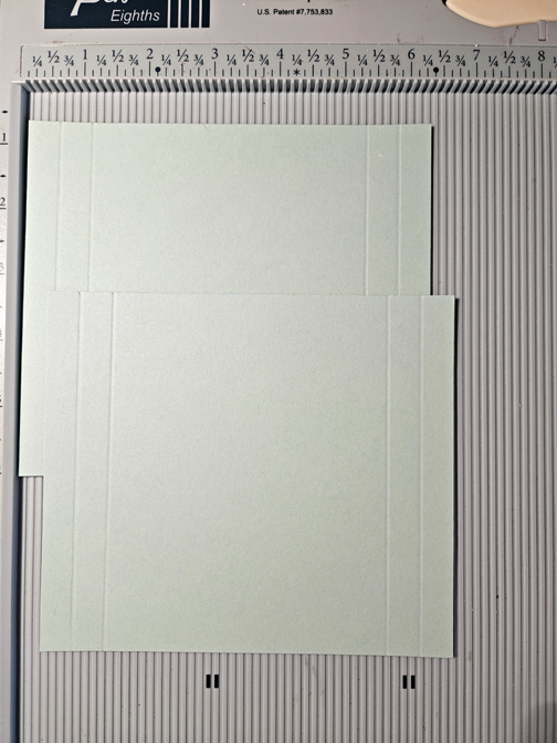
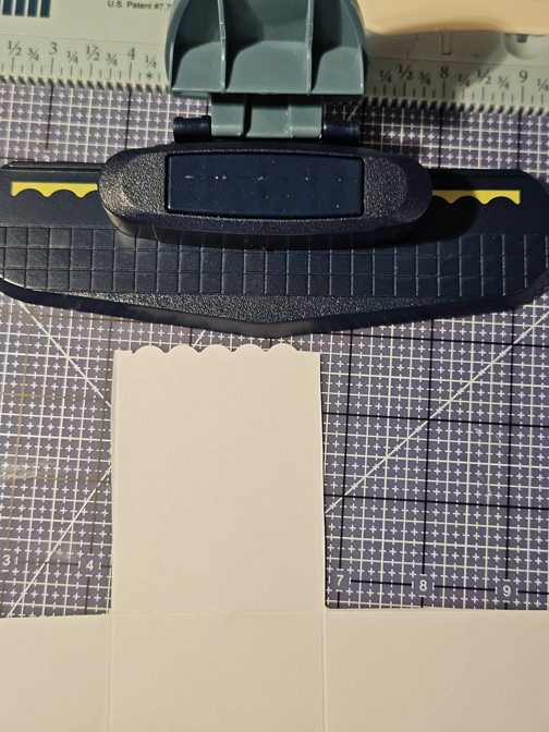
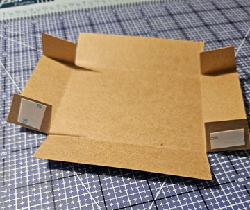
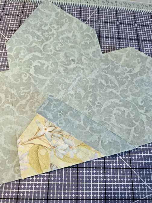
Start by taking a piece of patterned paper measuring 8″ x 8″ and placing it on the Scor-pal on the diagonal. I placed the Scor-Envi in the lower left hand corner to keep the paper in place. This is optional – if you can keep your paper in place without the Scor-Envi that is fine. Make sure the left side of the paper is right up against the left side of the Scor-Pal. Score at the 3″ mark. Rotate your paper to the left and score again at the 3″ mark. Continue rotating and scoring for all 4 corners.


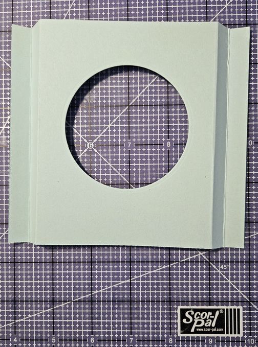
Once you’ve made your scores at the 3″ mark you will see that there is a small triangle created at the intersection of each score. Cut each of those small triangles out. Your paper should now look the the second image below.

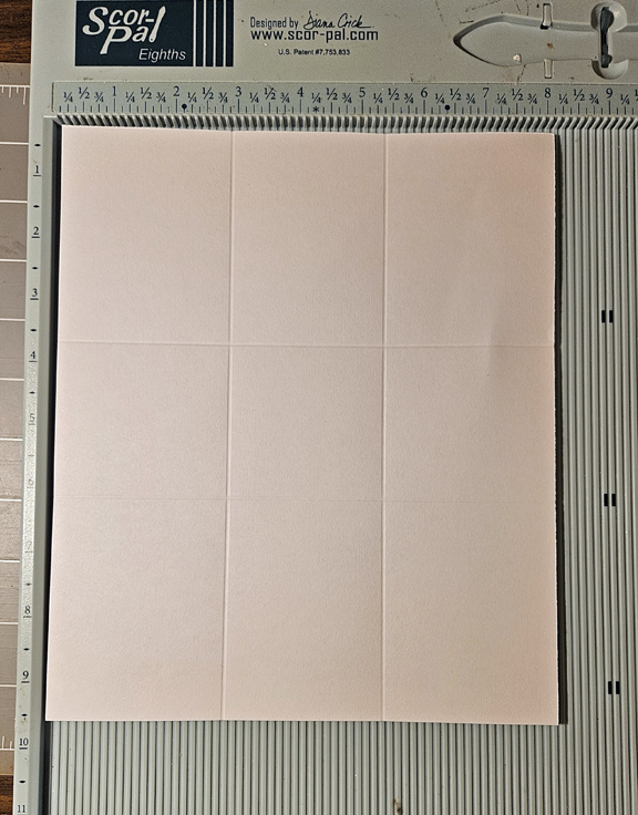
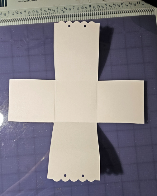
For the next group of score lines place your paper against the left edge of the Scor-Pal and made a score at the 1″ mark – ONLY SCORING DOWN TO THE AREA WHERE YOU MADE THE CUT OUT.

Rotate your paper to the left and do the same for the other sections – only scoring down to the cut out section.
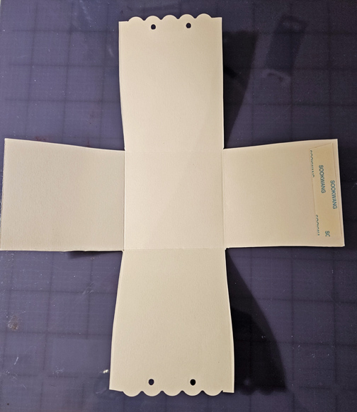
Once the scoring is done fold the larger sections in towards the center. The smaller sections are then folder in the opposite manner (folded out) You can secure the smaller sections with Scor-Tape.
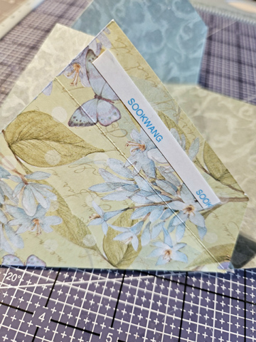
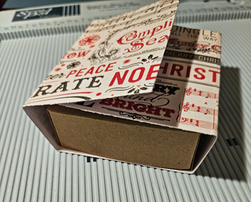
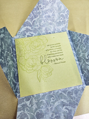
Place a 4″ piece of cardstock on the inside – here is where you can stamp a sentiment or write a note.
Fold over each section one at a time

For the last section you will need to tuck it in under the first section.

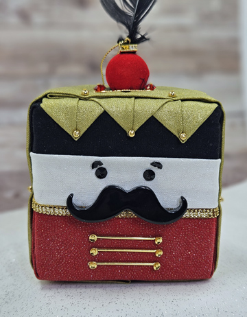
When closed the card with have a pinwheel design.

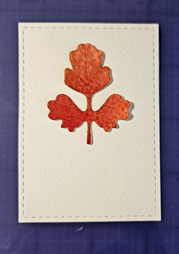
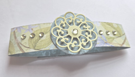
For the band I took a strip of the same patterned paper measuring 11″ x 1″ and wrapped it around the card, securing it with tape. For the embellishments I used some die cuts and rhinestones.
Thanks for stopping by today! I hope you found this tutorial helpful!