I’m seeing these colors in some variation all around me – a light blue/aqua paired with a rich red/violet. They can be found in Basic Greys Eskimo Kisses line, in the latest holiday line from Cosmo Cricket and I even saw this color combo at Cracker Barrel the other day on one of their holiday tree displays!

Materials Used: Stamps - Flourishes Holiday Greetings; Paper - Flourishes (white), SU (blue and pomegranate); Ink - Palette Ballet Blue, Marvy Aubergine, Other: ribbon, rhinestones, cuttlebug folder, slice machine
I first paired these colors a year or so ago (or was it longer?) when SU issued its beautiful pomegranate paper. I wish they had made this a permanent color – I’m running low on my supply! I used it with their soft sky and immediately fell in love with the look! So this year several of my holiday cards will be made using these colors.
This card was a snap – the blue panel was embossed with a cuttlebug folder and a panel of pomegranate dp was added on top. The die cuts were made with a slice machine. The sentiment is from Flourishes Holiday Greeting set and was stamped with a Marvy marker and sponged with Palette Ink – ballet blue ink. Rhinestones and ribbon complete the card.

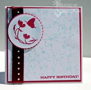
Materials Used: Stamps - Flourishes (sentiment), SU (flower), Rubbernecker (background); Paper: Flourishes White, SU Pomegranate; Ink - Palette Ballet Blue, Marvy Aubergine; Other: Ribbon, pearls nestabilities
With this color combo fresh in my mind, I decided to make a birthday card – somthing I am always in need of! Using the same color scheme I put together this card – soft and feminine. The hardest part was lining up the pearls on the ribbon! I used circle nestabilities to cut out the shapes and sponged some color on the circle before stamping the image.
Thanks for stopping by!


Oh yes, I do like this combo too, the birthday card is just beautiful.
Both cards are beautiful! I love the embossing on the first card!
These are both wonderful cards! The first card was so elegant and crisp. Love how you added the ribbon for a nice soft touch.
I wish they made pomegranate permanent too! I love this card, I never thought to pair these colors together!
both are beautiful, love the colors.
Those are gorgeous, I love the red ribbon and embellishments on the top one, they are both really pretty!
You know how your eyes play tricks on you every once in a while? Well, I was looking at your title here and thought I read “Least favourite colour combination” Gasp…what???? Scandalous!!!! Then I started reading the detail… and was very relieved… I too love this combo and what you’ve done with these two cards. The top one is my favourite. There’s such beauty in simplicity!!
Beth